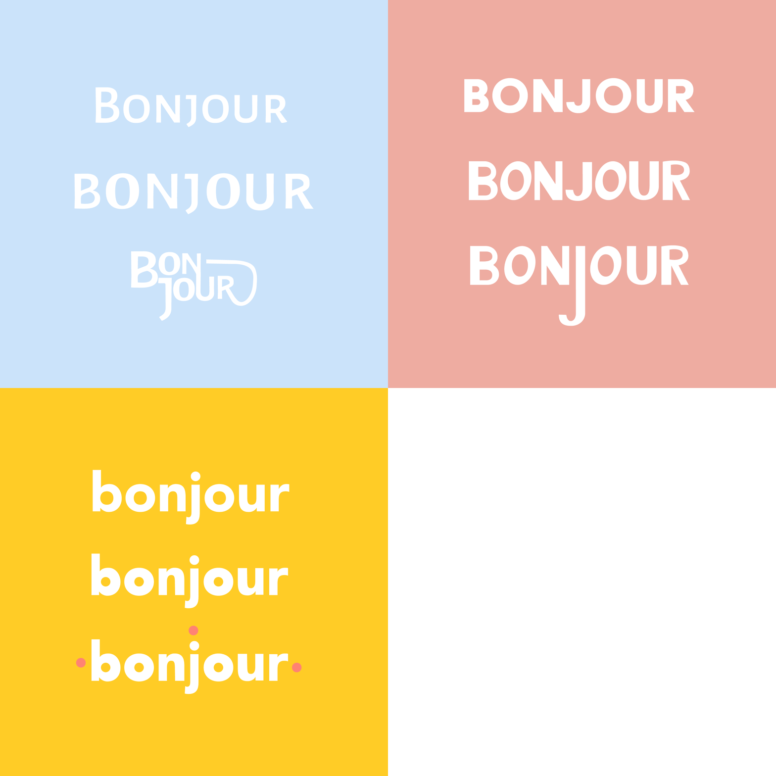
Explore: Typography
This week I explored typography! In the past, I’ve done a few typography-specific projects (like a logotype project and some editorial headings) but I’ve never felt like it’s been my strong suit. I’ve never sat down and really explored what can be done with typography. Honestly, I’ve always been incredibly intimidated by type. I feel like I don’t have enough creative Ideas for manipulating it, and I always second-guesss my typeface decisions. This week gave me the opportunity to really sit with some of that discomfort to demystify it a little.
Honestly, it’s been incredibly rewarding! I have found so much joy in drawing type by hand, and analyzing type decisions in print & on the web. While my week of exploring type is over, I don’t plan on stopping the exploration. As with anything, I think practice will make it so much easier to work with, so I plan to keep practicing.
Any sources of inspiration (images, articles, videos, etc.)?
I found this article Paula Scher wrote about her love of typefaces, but specifically Artone. It was a nice read that demonstrated the timelessness of the impact of type over a career. I frequently also thought back to her episode for Abstract. There was one scene in particular that I thought of frequently. There is an animation that demonstrates how the mood of a typeface drastically changes when moving the middle bar on an “E”. When I would start to feel overwhelmed, I would remember how impactful even the smallest decisions can be. I also found some fun examples of type in print magazines!
What was the hardest part about this week’s exploration?
I frequently feel the weight of perfectionism on my shoulders so that most definitely played a part in my exploration of type. I felt discouraged in moments when looking at inspiration images. I felt like I might never be able to achieve the same level of creativity. While this would usually make me feel overwhelmed and thus lead me to abandon the project, I tried to use this as motivation. Practice creates progress. I was comparing my starting point to other peoples’ culmination of years of practice.
What was the biggest takeaway?
I had a few. First I realized the value of working with the uncomfortable. I feel slightly more comfortable than I did when I began. That’s progress! I also realized that once I push past the discomfort that I feel when I start a project or walk into uncomfortable territory, I find deep enjoyment. I just have to push through that initial, not-so-great moment of feeling overwhelmed. I also realized that many type decisions are subtle. Sure there are fun posters that use type in some really fun, creative ways, but some of the best solutions also were quite simple. I think it really boils down to doing what is necessary to communicate effectively. I also realized there are very few rules when it comes to type. I found a lot of examples where the designer did things that I thought “weren’t allowed”. This relieved some of the pressure of doing things “perfectly”.
What was the most enjoyable part?
I really, really enjoyed drawing type by hand. I’ve always really admired how Anna Nunez does this for her branding clients, so I decided to try it. While my work is far from perfect, I found it very therapeutic and it allowed me to feel a whole new sense of ownership over my creation. It also helped me to feel more comfortable with manipulation forms.
Here are some of my research findings through my old magazines
Here is some tracing work I did. I had a professor do this for a logotype project once and it always stuck with me.
Sometimes getting off the computer really allows for more creative exploration.
Here is an exercise I did, manipulating existing texts into something new. While many of the changes are subtle, you have to start somewhere. I look at this as a stair step to more progress next time.
Here are some examples of hand-drawn logotypes I made for a friend. Nothing too creatively Earth-shattering, but fun nonetheless.


